Analyse
The Analyse view gives you a data-driven picture of how your work is moving through your system — surfacing patterns, bottlenecks, and trends that aren't visible from the board alone.
Open the Analyse view from the view switcher (left-hand bar).
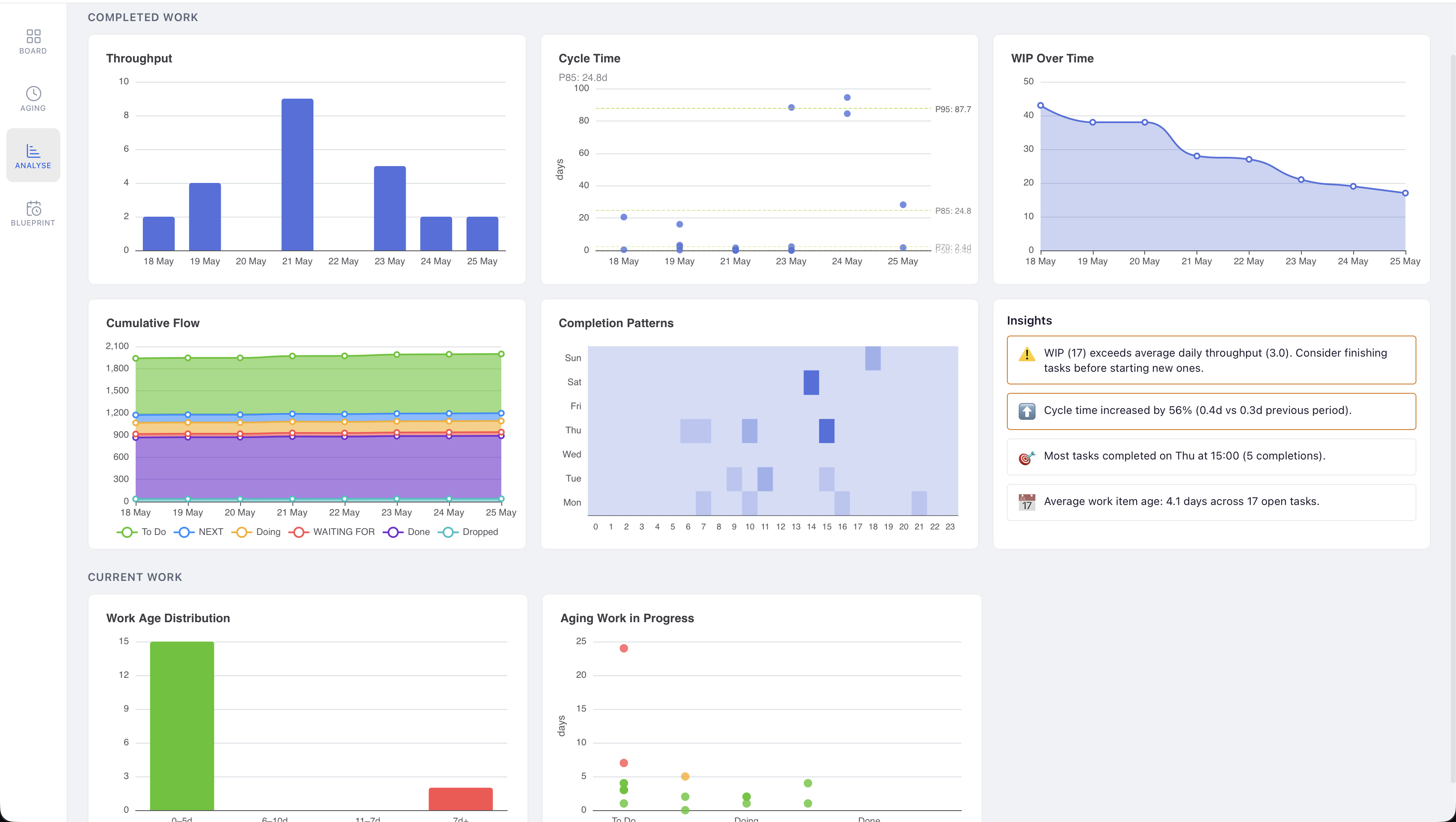
Completed Work
The Completed Work section shows metrics derived from your task history — how quickly work is getting done, when it gets done, and whether your system is healthy.
Throughput
A bar chart showing how many tasks you completed each day. Rising bars mean productive days; flat or empty bars reveal gaps. Use it to spot your natural rhythm and identify days where work stalled.
Cycle Time
A scatter plot showing how long each completed task took from start to finish (in days), with a P85 percentile line. Lower and tighter clusters mean predictable delivery; outliers flag tasks that got stuck.
WIP Over Time
A line chart of your total work in progress across each day. Sustained high WIP is a leading indicator of slower cycle times — if this line climbs without completing work, it's time to finish before starting.
Cumulative Flow
A stacked area chart showing how many tasks sit in each column (To Do, Doing, Done, etc.) over time. Parallel bands that grow evenly indicate smooth flow; a widening band in one column signals a bottleneck building up there.
Completion Patterns
A heatmap of completions by day of week and hour. Darker squares show when you tend to finish work. Use it to understand your productive windows and plan accordingly.
Insights
An automatically generated summary of the most significant signals in your data — things like WIP exceeding throughput, cycle time changes compared to the previous period, your most productive completion time, and average task age. Insights update each time you open the view.
Current Work
The Current Work section shows the shape of what's on your board right now — helping you spot tasks that have been sitting too long before they become ghosts.
Work Age Distribution
A bar chart grouping your open tasks by how old they are (e.g. 0–4 days, 4–8 days, and so on). A healthy board is weighted toward the left; a tall bar on the right means a pocket of old, unfinished work that needs attention.
Aging Work in Progress
A scatter plot showing individual open tasks plotted by age (in days) across your columns. Each dot is a task — the higher it sits, the older it is. Outliers at the top are your most neglected tasks and the best candidates for a review or drop.
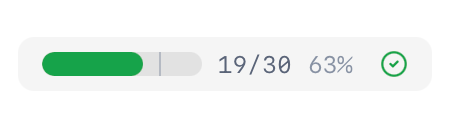
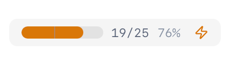
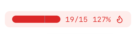
WIP Gauge
The WIP (Work In Progress) Gauge helps you monitor your workload by providing a visual indicator of how much is currently in flight.
The WIP Gauge appears in the toolbar as a horizontal bar with colour zones:
- Green: Work in progress is at a healthy level
- Amber: Work in progress is approaching your defined warning threshold
- Red: Work in progress has exceeded your maximum threshold
Keeping your WIP within appropriate limits helps improve focus, increase throughput, identify bottlenecks, and maintain a sustainable workload.
Configuring the WIP Gauge
- Go to Settings → WIP Gauge
- Enable the WIP Gauge toggle
- Configure your thresholds:
- Warning Threshold: When exceeded, the gauge turns amber
- Maximum Threshold: When exceeded, the gauge turns red
- Choose whether to include Queue columns in WIP calculations:
- When enabled, tasks in Queue columns count toward your WIP
- When disabled, only tasks in Active columns count toward your WIP
Task History
Task History provides an audit trail of every state change for every task on your board. It records when tasks were created, moved between columns, blocked, unblocked, completed, and more.
You can view a task's full history in the Task Inspector to understand how it got to its current state. Nothing hides in plain sight when you have a complete record of how your work has moved through your system.